

The Japanese rilegatura represents one of the vertices of the world's librarian art: an ancient, refined technique capable of transforming a volume into an oggetto of the collection. Negli ultimi anni, il settore dell'editoria di alta gamma e del packaging de lusso ha risscoperto questa tradizione, espesso indicata a livello internazionale come Japanese binding luxury book, integrated into editorial programs that require aesthetics and durability at the same time.
Understanding the meaning of the book means it enters a universe where it is possible to have a detailed program, a material that tells an intention and a large volume that gives you a first-time visual experience. In this article we explore the technique in depth, since its origins are based on more sophisticated contemporary applications.
Rilegatura giapponese libro lusso | Technical guide
Reading time: ~12 min
This is the Japanese tradition and how it differs from the Western world
Technical limits of the applicable power: speed, resistance and page speed
Contemporary applications in publishing and packaging in luxury in Italy
La giapponese rilegatura comes scelta di eccellenza editoriale
Riassunto in breve
This is the Japanese rilegatura: definitions, stories and differences between traditional Western languages.
Perché è ideal for the book of lusso: valor craftsmanship, apertura piatta, estetica della cucitura a vista.
Materials and process: acid paper, linoleum, premium cardboard and template perforation.
Historical variants: watoji, orihon, kansubon and detchōsō a confrontation.
Technical limitations: Loads a lot of the book block, resists it and leaves the pages.
Contemporary applications in Italy: Art book, photo portfolio, catalog and limited editions.
Come see the partner right: technical criteria, craftsmanship and personalization capabilities.
This is the Japanese tradition and how it differs from the Western world
The giapponese rilegatura, nota in giapponese come toji (綴じ) o più precisamente watoji (和綴じ), è una assembly technique of the book in which the page comes with the unit facing a view on the side edge of the volume. A difference from the traditional Western style, when it comes to the back of a fabric layer, on top or in the cardboard, the Japanese style carries the wire all over the world, transforming the kitchen into a decorative element of its own. It results in a volume of essential, quasi-meditative aspect, with the structural structure of the aesthetic language.
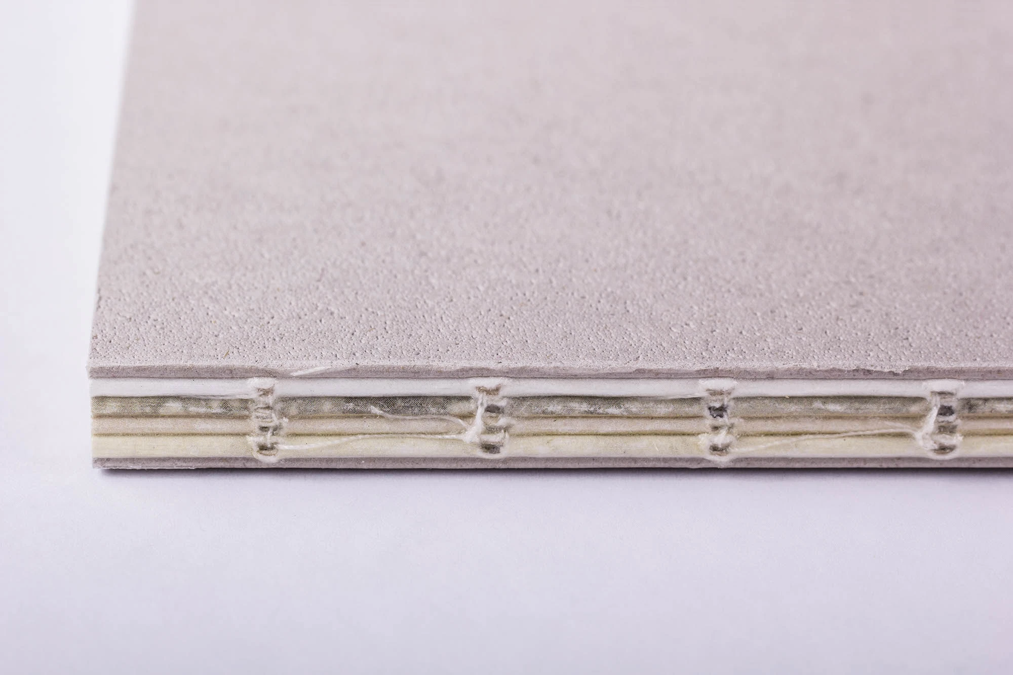
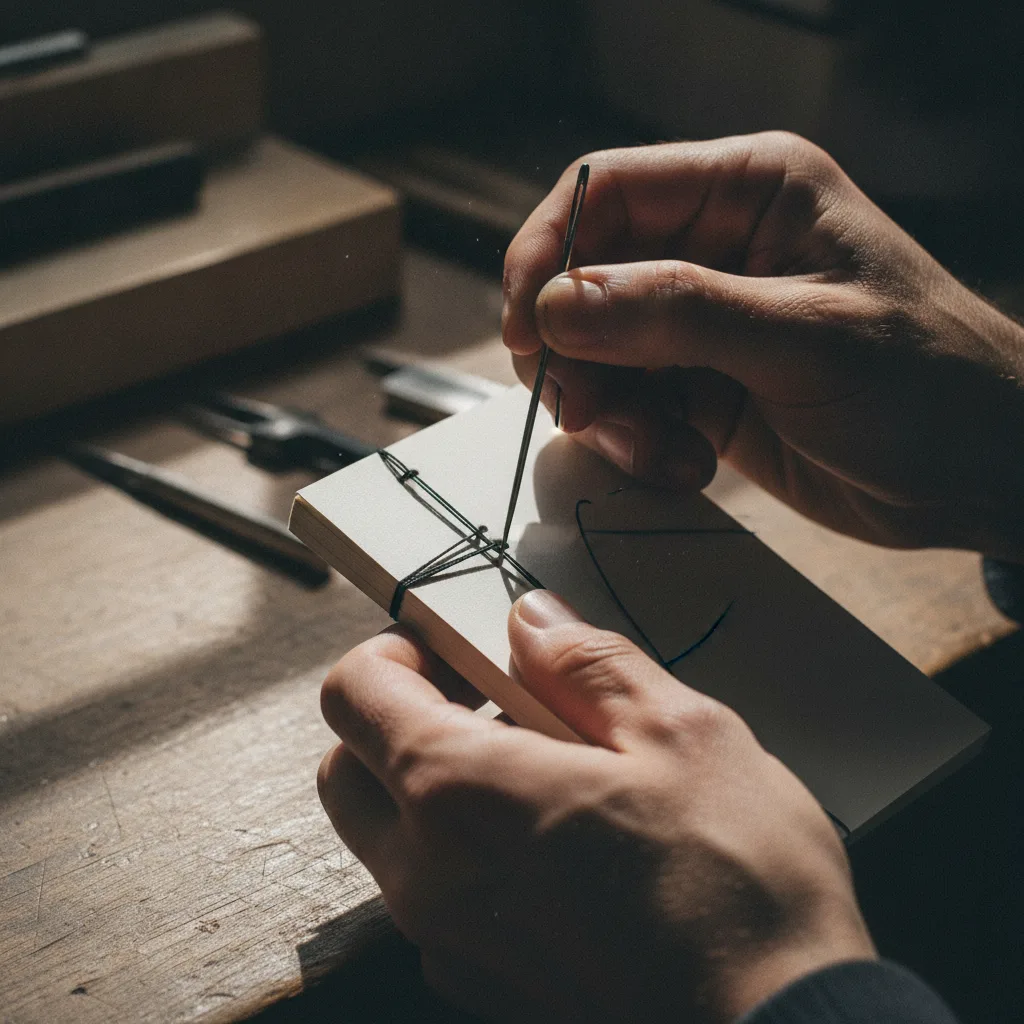
Nella sua forma classica, the giapponese rilegatura non-prevented use of the glue: the page, please put it on the foglio with the edge on the reverse side, then assemble it on a rigid or semi-rigid cover, which is cooked by hand through a series of practical ones on the edge.. The number varies typically from four to six, depending on the cooking reason. This last aperto, privo di qualsiasi incollatura, conferisce al volume a structural leggerezza and a reversibility of the Western rilegature with colla that cannot be offered.
Another fundamental difference keeps the volume aperture. The Japanese permission allows a good view of the image, the characteristics of the following images in the catalog, the photo album and the art book intended for consultation on the surface of the room. However, due to the fact that the page is in the fog, the page is visible in real life when there is an additional fog: this means that the retro page of the page is inaccessible, it does not have precise details on the projected graphics and on the page.
The variant of the story of the Japanese tradition
The Japanese library tradition is in diverse forms, with its own structural characteristics. He kansubon It is the traditional word, the oldest form of written support in Giappone, derived from the Chinese tradition. L'’orihon In this book you have a sound system, you have a long fog in alternate sections, you can cook it with a structure that allows you to consult it in sequence if it is open in all its length. He detchōsō It is necessary to have a loose belt, dove the vengono page fitted on the back with a legante, avvicinandosi maggiormente all the western structure.
The most popular format was published in the latest edition watoji, the traditional cooking style, which precedes the view and decorative cooking on the border. This is the technique of the contemporary art legacy reinterpreted with modern materials, combining the grammar of the Japanese card with washi cardboard, riveted in the skin or decorated card of the Italian or Japanese manufacturer.
Material and process: the technique goes through
The quality of a handmade product depends on the decision of the material. For a pre-booked book, any component must be selected according to precise criteria.
Carta senza acidi for the book block: guarantees the preservation of the finished volume of the volume if it is damaged due to fiber deterioration over time. Filo di lino per legature: resistant and available in various colors, it is an integral part of the graphic design across the decorative cooking point. Precious cardboard box for the cover: specially riveted in washi paper, in decorative paper, in fabric or in pelle, a seconda del posizionamento del progetto.
The washing process is very precise. If you leave preparazione del blocco libro: If the fog is left, it is covered with fog, collected and aligned with cura. If you proceed poi con la template perforation, a guiding instrument that ensures the perfect equidistance and the consistency of all the edges. It is a fundamental template to maintain the millimetric precision necessary in a luxurious numerical edition. Successively if esegue the hand-craft, passing the filo across and fori secondo the motivo scelto, che può essere semplice or elaborato, con variazioni geometriche ce che augmentano la complessità estetica del volume. The film comes to light in anticipation, generally if it changes the height of the book, to guarantee that it is sufficient to complete the intero motivo without intermediate visibility.
Confronto tra le principali tecniche de rilegatura per l'editoria de lusso
Confronto tra cinque tecniche di rilegatura per l'editoria di alta gamma Tecnica Cucitura a vista Apertura piatta Uso della colla Ideale per Rilegatura giapponese (watoji) Sì Buona No (forma classica) Libri d'arte, portfolio, edizioni limitedate Rilegatura cucita su nervi No Ottima Sì (dorso) Cataloghi voluminosi, monograph Rilegatura Bradel No Buona Sì Rapporti aziendali, edizioni di pregio Rilegatura copta Sì (dorso aperto) Eccellente No Libri d'artista, album fotografici Brossura fresata (perfect binding) No Limitata Sì Cataloghi commerciali, tirature media
Technical limits of the applicable power: speed, resistance and page speed
Notwithstanding that this is an indisputable pregiest, the legality of the application presents some technical limits which are important to consider first of all for an editorial project. The main riguarda lo spessore del blocco libro: the classic technique is adapted to the volume of content, generally not superior to its size. Blocking more pressure makes it difficult to cook uniformly and may compromise the volume hold at the tempo.
A second limit regarding the paginazione. Poiché ogni foglio vienene piegato a metà, il retro di ogni pagina rimane all'inno della piega e non è stampable in conventional mode. This means that in a traditional Japanese river, only one side of the fog is visible, it is due to the size of the surface which is visible on a western river. For this limitation, any version of the ibride prevedono the incollaggio of the fogli has due to due, make it accessible by the facciate my rinunciando parzialmente alla purezza della tecnica original.
There resistance in time, if the material is of good quality and the cooking is done correctly, it is elevated. The Japanese oil seal, paradoxically, tends to last longer and longer than the long-term oil, but it does not cause any deterioration of the chemical leg. This makes it particularly suitable for the archive, editing the collection and volume intended for long-term conservation.
Important
The traditional Japanese version is not adjusted to a volume greater than 200–250 pages visible, causing the structural limits of the side cooking. For more voluminous editorial projects, it is possible to choose a variety of complementary technologies that complement the aesthetics of the film at a glance.
Contemporary applications in publishing and packaging in luxury in Italy
Therefore, the Japanese language is applied in a growing variety of editorial contests and high-quality communications. In Italy, dove la culture typografica e la legatoria d'arte hanno radici profound, questa tecnica viene impiegata per progetti che richiedono imatto visivo e tattile immediato, capace di communicate qualità prima ancora che ilettre apra il volume.
Lusso editorial applications
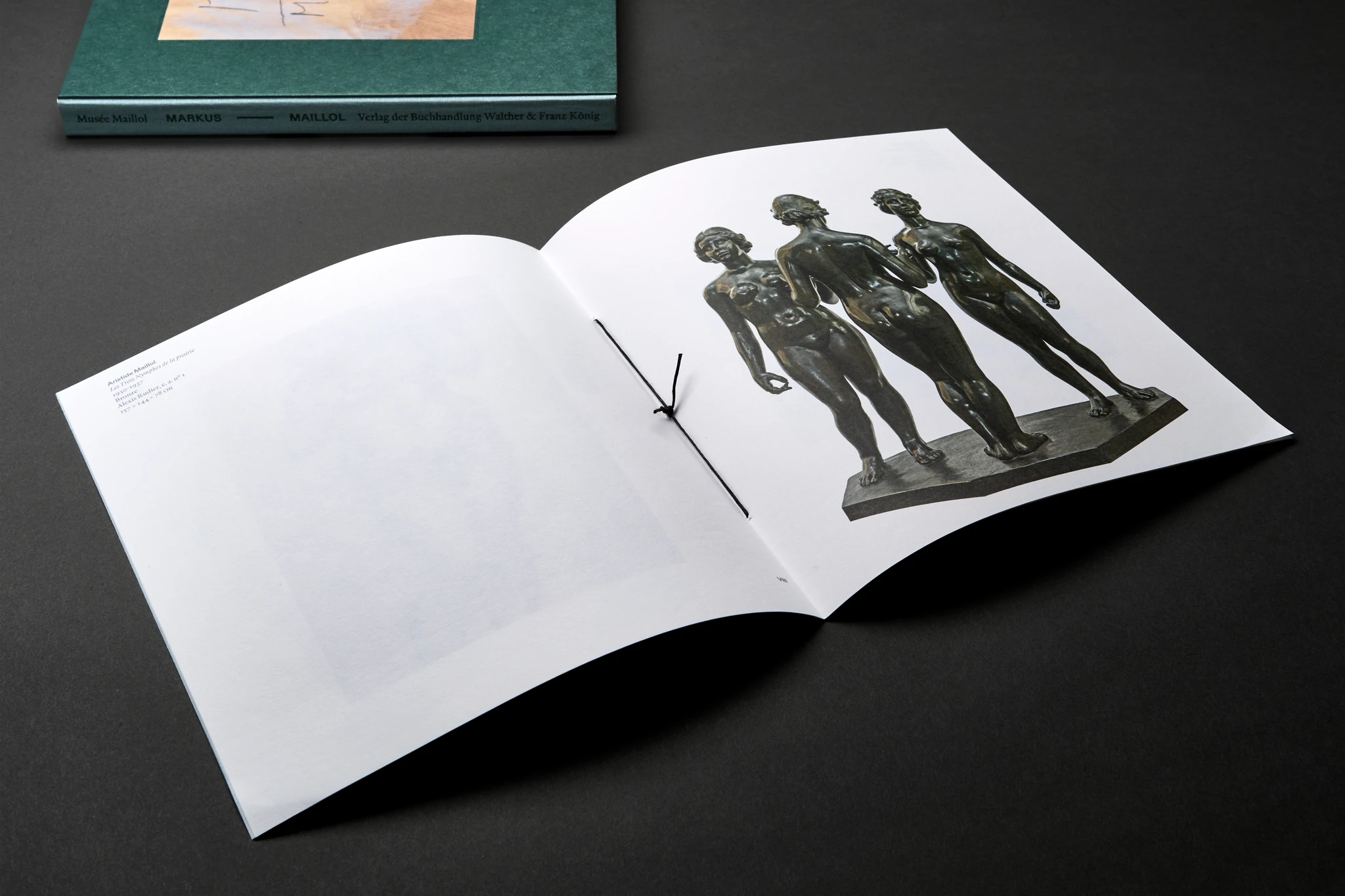
I contest more diffusion including art book and catalog of most photos, dove la legatura giapponese valorizza le immagini atraverso a apertura piatta che elimina qualsiasi siasi deformazione della pagina. I luxury photography portfolio, intended for professional photography or a creative agency, find the rilegatura manually prepared in a format capable of distinguishing clearly from a digital portfolio or from a rifilate stamp. I catalog of the high fascia, I report financing and report of stability intended for an investor and stakeholder of the first livello utilizzano sempre more spesso the rilegatura giapponese personalizzata as instrument of position, transforming a documento istituzionale en un oggetto da conservare. You can hope to see some of the concrete facts of this project galleria dei lavori realizzati.
Anche il settore del luxury packaging It integrates elements derived from the tradition of oriental heritage: rigid glass with decorative cooking on the outside, cooked alette with colored filo, inserted with foreign cooking. This element, applied to cofanetti for premium spirits, packaging for jewelry or photo album for cosmetic house, creates an unboxing hope that goes well beyond the simple delivery. To deepen the possibility of the campo del high-end packaging, you can view the dedicated section.
Good to know
The Japanese washi paper, traditionally used without volume, is available in various sizes and textures, with a translucent and almost impalpable version, with a finer structure and opaque finish. Its compatibility with the high quality offset stamp makes it excellent for publishing art that combines traditional art and contemporary stamp technology.
Come and see your partner for a luxurious link
The partner's secret allows for a successful delivery program that is rich in value and diversity. Not all of the stamps or labels are proponent of this technique with the depth of skill, and the difference will result in a mediocre result and an excellent edition depending on the detail on its own and its handling.
Partner selection criteria
I value criterion with careful attention to the’esperienza artigianale documentata, the capacity to consume with certified material and verificable quality, the availability to make prototypes first of the final print and the padronanza of the photographic frame and stamp that precedes the rilegatura. A valuable partner who accompanies the project at the end of the brief, suggests the combination of materials to match all the aesthetics and functions, anticipating the technical incompatibility and guaranteeing the consistency of the creative vision and the finished object.
Supporting Maestro Premium Printing
In Maestro Premium Printing, the design of the Manufacturing Company is not the owner of this specification: it is technically presented in the production process, although in Italy it is not in international production, to guarantee that there are any dettaglio - from the perforation to the template along the tension of the linen filo - This corresponds to the standard edition of the original number. Our hope is in the design of the card and in the management of the graphic file which allows you to offer technical advice at the moment, at the time of approval of the visual stamp and at the minimum of risk of the cost of the project and the finished product. Per scoprire i nostri editorial program of high gamma, poet visit the section dedicated to the edition, oppure contact me directly for a personalized warning.
La giapponese rilegatura comes scelta di eccellenza editoriale
The Japanese language is the most important part of assembly technology: it is a visual and tactile language that communicates well, with the intention and primary value of the contents even if they are there. In a market where there is a greater difference in the sensorial piano and the material experience, you can find a link for a book of art, a photo portfolio or a catalog of luxury items that are significantly invested in a title that the recipient immediately perceives as a sign of distinction.
The safety is the partner's ability to tradurre that intends to have an impeccable technical result, with good materials, good cooking and precision only the craftsmanship of the high quality book can be guaranteed. Se stai valutando una production with direct supervision in more locations, our product structure is designed to guarantee consistent quality with the first copy of the final copy.
FAQ about the rules used by the Lusso editorial office
What is the difference between the current and current connections?
Entrambe sono relegature cucite a vista, but if there is any difference in the structure of the back and in the percorso of the filo. The connection has been made completely open and the fascia is fired directly at the same time, it allows an opening for more than 200 meters. The Japanese ribbon, invece, causes the page to be drawn laterally across the border, with a diverse aesthetic effect and a structure more suited to the fogli singoli piegati.
Is it possible to personalize the cooking motive in a handmade dish?
Yes, the reason for cooking is one of the most flexible elements of this technique. This geometric variation is complete, the pattern is inspired by the traditional textile fabric and can be solved in collaboration with the client. The influence of the influenza motive is the aesthetics of the volume and the tempo of the treatment, with a direct impact on the final cost.
Is the Japanese rilegatura suitable for elevated tirature or solo per piccole series?
In its classic art form, the Japanese rilegatura is more suitable for a limited edition, typically in the pocket for every hundred copies. For higher product volume, it is possible to use a semi-industrial process to replicate the cooking style with high efficiency, to maintain a high-quality, high-quality product. The price depends on the budget, size and position of the project.
How much does the translation end up on the final cost of an art book?
The cost of a hand-crafted machine is significantly higher than the frequency of the brush or an industrial standard, due to the manual washing time and poor material quality. The main variations are the page number, the type of wire and the cover, the completeness of the cooking motive and the drawing. È semper consigliabile richiedere un preventivo dettagliato from the final project.
Is the washi card uniquely suitable for use in luxury?
No, the Japanese card was the most traditional and similar to the technology, but not the only option. Many editorial programs of the high range use the European map with selected grammatical acids, cotton map, riciclate map certificate or combination of more than one tip of the map to create contrasting textures throughout the interior of the volume. The card holder must be calibrated according to the anticipated stamp function, the final weight of the volume and the visual effect desired.
Is it possible to combine the rim with a noble technology like the hot stamp or the bowl?
Absolutely yes. The cover of a volume with rilegatura giapponese if ready molto bene all'applicazione di lamina a caldo, goffratura, varnishing selective or punzonatura. This enhanced technology amplifies the premium effect of the volume and its particularly effective sound on the copper plate riveted in decorative paper, skin or textile material. The combination of original and refined stamps is presented in one of the highest standards of the Italian publisher.